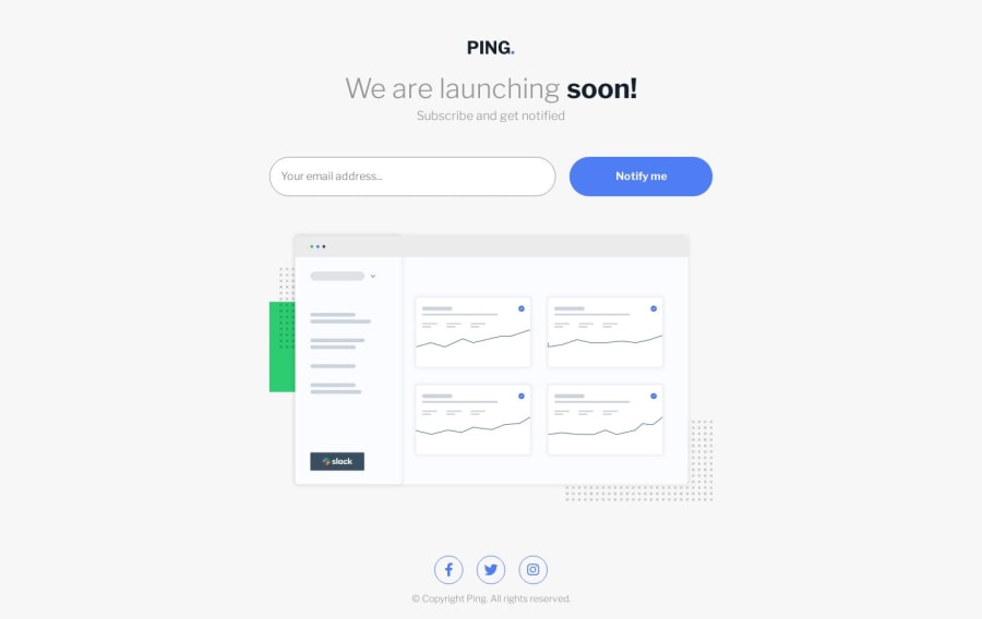
🚀 Mobile-first Ping coming soon page 🚀

Design comparison

Solution retrospective
Hello Frontend mentor community! :)
I began this project with my preferred approach, which is mobile-first design. I find it to be a very effective methodology. The web layout itself was relatively simple, and did not require much thought. However, I did have to focus on designing the form, ensuring that it was both responsive and aesthetically pleasing. I believe I achieved these goals, and am pleased with the final result.
During the project, I experimented with the clamp() function, which allowed me to create a header that is responsive across all devices, from PCs to smartphones. This function proved to be very useful.
However, I did encounter some difficulties when setting the maximum width of the input field during the transition from phones to higher resolutions. Ultimately, I discovered that setting the width to 100% solved this issue.
From a JavaScript perspective, the project was relatively straightforward, although it did provide me with some valuable practice. Overall, I am very happy with the final outcome, and found the project to be both enjoyable and rewarding.
I began teaching myself HTML and CSS approximately one and a half weeks ago, and my primary objective is to complete all of the Newbie projects. My intention is to enhance my skills in HTML and CSS to the fullest extent possible before progressing to more complex projects involving complex JavaScript. I invite you to join me on this journey as I continue to solve more challenging projects. As of April 30, 2023, I have successfully completed 12 out of the 18 available Newbie projects.
Community feedback
Please log in to post a comment
Log in with GitHub
Join our Discord community
Join thousands of Frontend Mentor community members taking the challenges, sharing resources, helping each other, and chatting about all things front-end!
Join our Discord