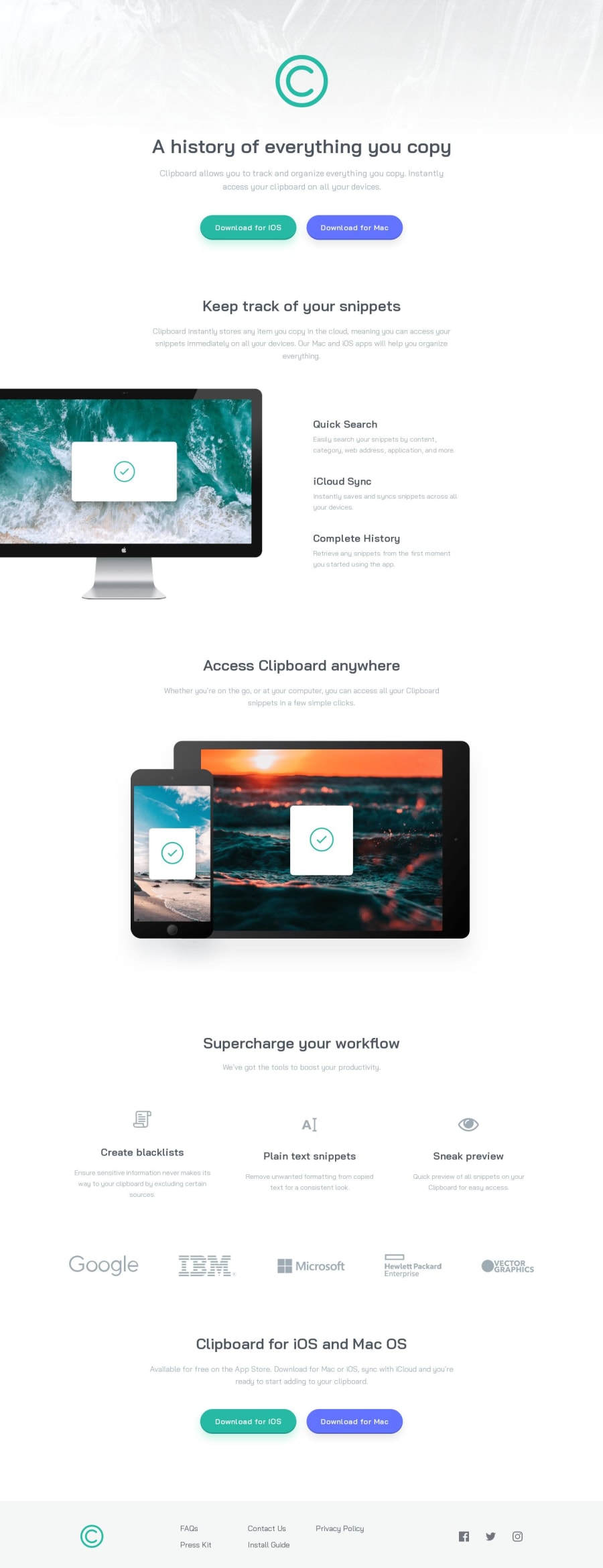
Design comparison
Solution retrospective
Hello Frontend mentor community! :)
During this project:
-
Generally i learned utility classes and how to use them but i am not sure if i used them correctly applying to classes? i would love feedback on that.
-
I learned how to change the color of an svg if it is in a img tag, i played a lot around it and in the end opted to use filters on it. I know that it is not the best approach but i dont like it when the svg is used inline in the HTML.
-
Learned a cool hover effect on buttons, I love it and will definitely use it more.
-
I tried to make it as responsive as i could and i think i did a good job overall, hovewer i think i should have used clamps for the font sizes? right now i have 2 fixed sets which i change with media query.
-
followed a mobile first approach
-
There is a white line under my solution screenshot why is that? i don't see it on my live site.
I began teaching myself HTML and CSS approximately a month and a half ago, and my primary objective is to complete all of the projects. Last week I finished the last Newbie project and this is my fourth Junior one. My intention is to enhance my skills in HTML and CSS to the fullest extent possible before progressing to more complex projects involving complex JavaScript. I invite you to join me on this journey as I continue to solve more challenging projects. As of May 14, 2023, I have successfully completed 4 out of the 29 available Free Junior projects.
Community feedback
Please log in to post a comment
Log in with GitHubJoin our Discord community
Join thousands of Frontend Mentor community members taking the challenges, sharing resources, helping each other, and chatting about all things front-end!
Join our Discord
