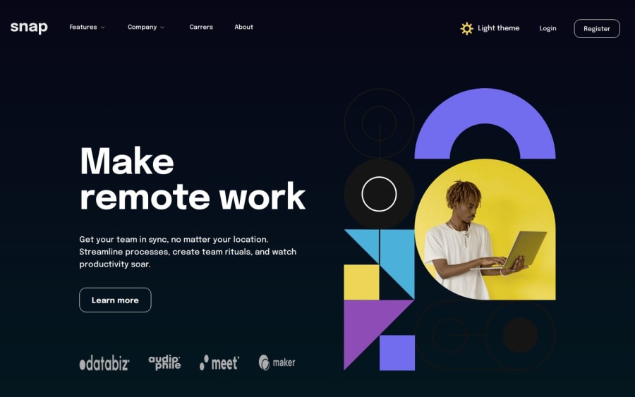
π¨βπ» Intro section w/ dropdown w/ (HTML + SASS + JS Dark/Light Mode)
Design comparison
Solution retrospective
π¨βπ» Hello everyone.
DAY 7/7 ππ
Finally the end ahuauha, I can't describe how productive this week was, I learned a lot of new things and managed to practice a lot! Within what I learned the two most important things are:
- Bootstrap
- SASS
Plus my javascript skills have improved a lot!
Anyway, I leave a tip for those who want to improve, whether with a developer or anything else, persist! Resist the challenges that the world will put in your life, and most importantly learn from them, I guarantee you that at the end of the day all the effort will be worth it.
After this week I feel like I can learn anything, after all, it only depends on me!
I added some details:
- π¨βπ» Custom menu bugger!
- π¨ Custom colors and hover!
- π¨βπ¨ Dark/Light Mode!
Feel free to leave comments on how I can improve my code.
Thanks! π
Community feedback
- @correlucasPosted about 2 years ago
Congratulations bro, youβre an inspiration and you did great doing 7 projects on 7 days, this is insane, considering the projects are advanced and with JS. The design is amazing and I liked a lots that you placed the dark mode in the burger menu. Congrats for the 7/7 and the motivation. π
Marked as helpful0 - @rodrigompiresPosted about 2 years ago
Hello Adriano.
Nice work, but I think there is a small detail in the mobile version in the theme change icons.
On the first click, the rotation animation occurs, but on the second click, the animation no longer occurs.
I don't know if it's on purpose, but it only comes back when clicking outside the menu.
Hugs and nice work.0@AdrianoEscarabotePosted about 2 years ago@rodrigompires Obrigado! eu percebi que tava acontecendo isso, mas nΓ£o deu tempo de arrumar ahuauahua
0 - @livinglifemeaningPosted about 2 years ago
Congratulations Adriano for finishing your challenge! What's going to be your next one? Only tip is to use align-items property and change it's default from stretch so those brand icons don't look ugly on desktop. Also, can I ask how you implement different color schemes? I took a look through your code but couldn't tell how, and it's something I'm trying to learn.
0@AdrianoEscarabotePosted about 2 years ago@livinglifemeaning I learned by watching this video: https://youtu.be/9LZGB3OLXNQ
I'm going to take this week to improve my js, so I don't know when I'll do any more challenges haha, but one of my goals is to use react or something new in the next challenge
2
Please log in to post a comment
Log in with GitHubJoin our Discord community
Join thousands of Frontend Mentor community members taking the challenges, sharing resources, helping each other, and chatting about all things front-end!
Join our Discord