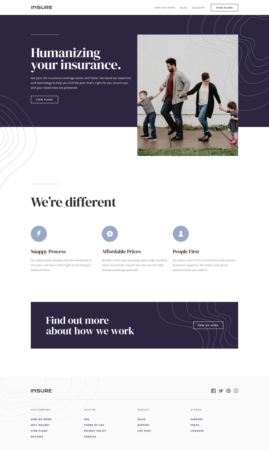
Design comparison
SolutionDesign
Solution retrospective
🎄 Project
- Responsive for mobile & desktop, range 160px+
🔎 Questions
It was my first landing page project, and I think I made some accessibility mistakes
- For menu button, I used a div, with three spans inside it. The reason of doing that's to make animated toggle button. Should I put "aria-hidden=true" for the spans (they're just some lines) while I putted an "aria-label" for the parent tag?
<div aria-label="open menu" class="buttons-countainer">
  <div class="lines">
    <span class="line upper-line"></span>
    <span class="line middle-line"></span>
    <span class="line bottom-line"></span>
  </div>
</div>
- I know that any image content should have an aria-label. But how about the other contents? should we use labels for them?
Community feedback
Please log in to post a comment
Log in with GitHubJoin our Discord community
Join thousands of Frontend Mentor community members taking the challenges, sharing resources, helping each other, and chatting about all things front-end!
Join our Discord
