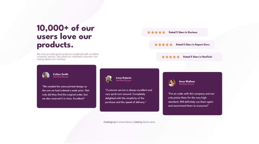
Design comparison
Solution retrospective
I'm proud to use Grid on this project and starting to use rem. I was also able to use position a lot (and especially the positioning of the background patterns that I had so much difficulty with last time). Furthermore, I also started to learn more about git and how to use the terminal, and this was my first project that I used another branch :D
I'm very excited about the next challenges ahead
What challenges did you encounter, and how did you overcome them?To be honest, the most annoying thing to do was the positioning of the scalable items, not because it was difficult but I was afraid that I was making a mistake. But it ended up that after finishing my challenge I popped into the gpt chat so he could check it out my code if there were unnecessary things or redundancy, to my great happiness he didn't find anything and said that my code was already well optimized!!
What specific areas of your project would you like help with?Still, if anyone has suggestions on what to improve, I look forward to it! 😁
Community feedback
Please log in to post a comment
Log in with GitHubJoin our Discord community
Join thousands of Frontend Mentor community members taking the challenges, sharing resources, helping each other, and chatting about all things front-end!
Join our Discord
