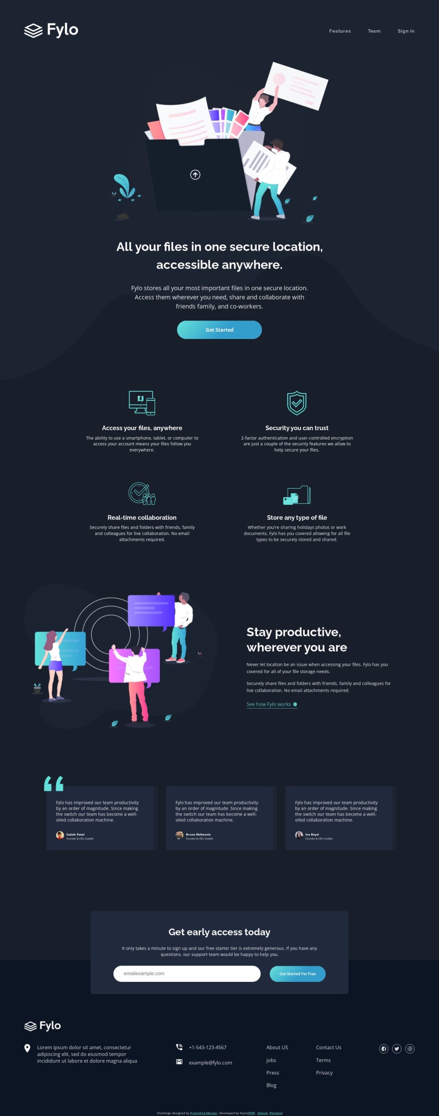
Design comparison
Solution retrospective
[🎄]
[🔰] Responsive
- Range 208px+
- Mobile 375px Desktop 800px+
[🌎] With
- Regex for validation
- No libraries and queries, all styled with CSS
- Semantic HTML5 markups and accessibility
[💖] I will be very happy to read your feedback!
Community feedback
- @Shadow-IO-oIPosted over 1 year ago
Hello, @KayloPortal!
First of all, I want to say that your code is very well-written, clear, and responsive. I really like it 🦊👍.
I have a few suggestions that might help improve the look of your site. At a width of 800px, there is still enough space to set the benefit row and feed row to 2 columns. Then, at 600px, you could set them to one column.
Additionally, the footer looks quite big. Perhaps you could consider setting the footer-links to three columns instead of one. On mobile devices, you could set it to two navigation columns and one social-links row.
Finally, I noticed that there are no hover effects on the address link, phone number, and email link. Maybe underlining or changing the color to white would look nice.
I hope these suggestions are helpful for you. 🦊
Marked as helpful1
Please log in to post a comment
Log in with GitHubJoin our Discord community
Join thousands of Frontend Mentor community members taking the challenges, sharing resources, helping each other, and chatting about all things front-end!
Join our Discord
