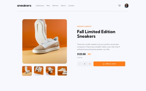
🔥 E-Commerce Product Page in React + Lightbox Gallery + Cart 🔥
Design comparison
Solution retrospective
This was pretty fun to build and i'm quite happy with how it turned out. 🧸
Community feedback
- @mksoofianPosted over 1 year ago
Hi @visualdenniss,
Your project looks great! The positioning and animations are near perfect.
Here are some constructive comments of what I found did not exactly meet the brief:
- The light box should only be showing when the large image is clicked. Your solution activates the light box when clicking a thumbnail when that should really be updating the large image.
- The Add to Cart button feature only populates a "1" in the qty bubble of the icon when it should reflect the number in the cart
- The qty in cart seems to be hard coded to "3" when it would ideally reflect the qty of the line item (connected to the qty bubble and the add to cart button)
- In addition to my previous note, the trash/delete icon should decrement the cart qty and register as "empty" when it reaches zero or empty
I think implementing the above improvements would really take your project to the next level. Good luck!
Marked as helpful1@visualdennissPosted over 1 year ago@mksoofian Thanks a lot for taking your time to give a valuable feedback! Lot of great ideas!
I usually don't aim to exactly meet the brief, so my solutions usually deviate from it according to my preferences or what i think is alternatively good.
- Agreed, lightbox could be also shown when the large image is clicked.
- Qty bubble was a deliberate choice, it shows the number of unique kind of products, many websites do that. And if you click the cart, it shows the amount you selected from that kind of product. If you select 3 and add to cart, it will show price x 3.
- I couldn't find what part you are referring to as hardcoded. If you select some number of items and add to chart, to change the amount, u just need to delete it from the cart and select the amount again and then add to the cart. Amount itself is dynamically coded.
- Yes, this could be another idea, connecting the - + icons to the cart dynamically. It is a different system from what i did and i did not want to connect that way, but it is also viable alternative. Used by many sites too i think.
Thanks a lot again for your suggestions and ideas! Much appreciated 🙌 Happy coding!
1 - @amitjaiswar1502Posted over 1 year ago
Exceptional solution... near to perfect, lot to learn from you!
0 - @manjubhaskar02Posted over 1 year ago
Your coding works are great.
Every project is a visual treat.
0@visualdennissPosted over 1 year ago@manjubhaskar02 Many thanks for the compliment! 🙌
0 - @Dougl4zPosted over 1 year ago
Achei legal que tu, deixou o background com um tom mais neutro(azul), é bom pra visualização, não deixa a vista cansada.
0 - @victoriagreatPosted over 1 year ago
Wow, it is really good.
0
Please log in to post a comment
Log in with GitHubJoin our Discord community
Join thousands of Frontend Mentor community members taking the challenges, sharing resources, helping each other, and chatting about all things front-end!
Join our Discord