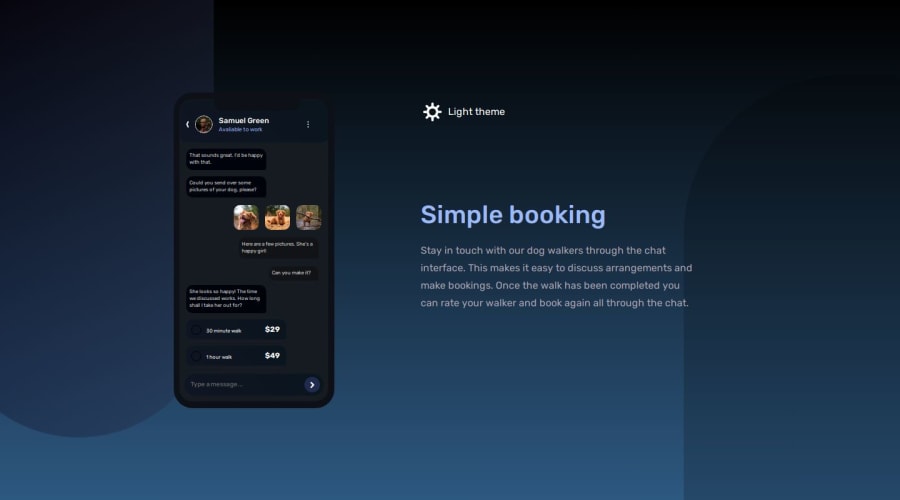
👨💻 Chat app illustration with (HTML + CSS + JS / Dark-Light Theme)
Design comparison
Solution retrospective
👨💻 Hello guys.
This is my solution to this challenge. It was a lot of fun and certainly the most challenging to do so far, I had some issues with the background elements, but I think I did a good job. My css codes are getting too big, I tried to avoid it but I couldn't hauahuahua I think it's time to start doing these challenges with some framework.
I added some details:
- 👨💻 Dark mode and light mode button
- 🎨 Animation in the background div
- 👨🎨 custom colors
Feel free to leave feedback on how I can improve my code. 😊
Thanks!
Community feedback
- @denieldenPosted about 2 years ago
Hi Adriano, congratulations on completing the challenge, great job! 😁
Some little tips for optimizing your code:
- add
maintag and wrap the card for improve the Accessibility - add
transition: all .8s ease-in-outon the body to smooth the change color theme effect - instead of using
pxuse relative units of measurement likerem-> read here
Hope this help! Happy coding 😉
Marked as helpful0 - add
- @correlucasPosted about 2 years ago
Boa! Ficou mto bom seja o design que o código! Os icones e as animações melharam demais desde o primeiro design com dark mode! Parabéns lek.
Adiciona esse media query no seu código pra reduzir o motion pros usuarios que tem como preferencia nenhuma animacao:
/* Remove all animations, transitions and smooth scroll for people that prefer not to see them */
@media (prefers-reduced-motion: reduce) {
  html:focus-within {
    scroll-behavior: auto;
  }

  *,
  *::before,
  *::after {
    animation-duration: 0.01ms !important;
    animation-iteration-count: 1 !important;
    transition-duration: 0.01ms !important;
    scroll-behavior: auto !important;
  }
}
Marked as helpful0@JorgeVVPosted about 2 years ago@correlucas I think the expectation for
prefers-reduced-motion: reduceis to reduce motion (animating translation, scaling, perspective, etc.) and not opacity and color change. Also, reduced motion doesn't mean no motion at all, you can make it more subtle or with a shorter duration.0 - @HinaSejaru124Posted about 2 years ago
I think it will have been better if you used
body { min-height: 100vh ... }Nice job and Happy Coding0
Please log in to post a comment
Log in with GitHubJoin our Discord community
Join thousands of Frontend Mentor community members taking the challenges, sharing resources, helping each other, and chatting about all things front-end!
Join our Discord
