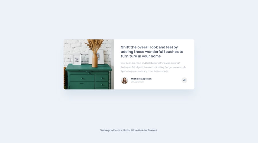
✔ Article Preview Component 5️⃣th Challenge - HTML SCSS Javascript
Design comparison
Solution retrospective
Hi All Coders.
It's my 5th Challenge here. I tried to make this Article Component as much close look to the Figma file I download. I think it is very close.
I had some problems with Javascript to open Socials. If you have any better solution let me know.
Happy coding to everyone 🐱🏍🎉
Community feedback
- @ApplePieGiraffePosted over 3 years ago
Hello, Artur! 👋
Nice to see you complete another challenge! 😀 Good job on this one! 👏
In addition to MilosSimic994's feedback, I suggest switching to a mobile-friendly layout just slightly sooner than 600px so that the sides of the card aren't cut off the page right before the layout changes. 😉
Keep coding (and happy coding, too)! 😁
0 - @MilosSimic994Posted over 3 years ago
HI Artur,
Your solution looks great.
As for JS, instead of adding 'display: flex' to #active, you can try to create an class active with 'display:flex', that you will add to the element you want to display in your case #active, in the function togg '{ element.classList.toggle("active") }' So it will add end remove a class that displays the element on each click as needed.
0
Please log in to post a comment
Log in with GitHubJoin our Discord community
Join thousands of Frontend Mentor community members taking the challenges, sharing resources, helping each other, and chatting about all things front-end!
Join our Discord