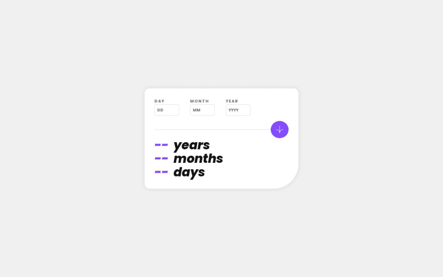
Design comparison
Solution retrospective
Hello Frontend mentor community! :)
This is my first Junior challenge, and I must say that I found it to be more complex than I anticipated. I dedicated three days to this project and encountered several obstacles that required extensive research. However, I am pleased with the outcome, although I acknowledge that further improvements can be made.
-
During the polishing phase of the project, I encountered two primary issues. Firstly, I encountered difficulty with the animation. Although I used a translate transform to create an animation that appears from the side and falls into place, I experienced difficulties with the text next to the animation constantly jumping as the numbers transitioned from one digit to two digits. While I am aware that setting an exact width may have resolved the issue, doing so would have conflicted with the project's design. As a possible solution, I considered developing a secondary animation that would allow the text to fall into their corresponding positions after the number animation completes. However, I remain uncertain about this approach.
-
Secondly, I encountered challenges when designing the project for larger screen sizes. Although I began designing the project with mobile devices in mind, I attempted to set the container's maximum width to a number and its child's width to 100%. Unfortunately, this approach did not work as intended, and I am uncertain as to why. Despite these issues, I intend to proceed to the next project and revisit this one later to address these concerns.
I would appreciate any assistance with these issues and look forward to resolving them in the future.
I began teaching myself HTML and CSS approximately three weeks ago, and my primary objective is to complete all of the projects. Last week I finished the last Newbie project and this is my first Junior one. My intention is to enhance my skills in HTML and CSS to the fullest extent possible before progressing to more complex projects involving complex JavaScript. I invite you to join me on this journey as I continue to solve more challenging projects. As of May 8, 2023, I have successfully completed 1 out of the 29 available Junior projects.
Community feedback
Please log in to post a comment
Log in with GitHubJoin our Discord community
Join thousands of Frontend Mentor community members taking the challenges, sharing resources, helping each other, and chatting about all things front-end!
Join our Discord
