

Design comparison

Community feedback
- P@rodrigopereira21Posted about 1 month ago
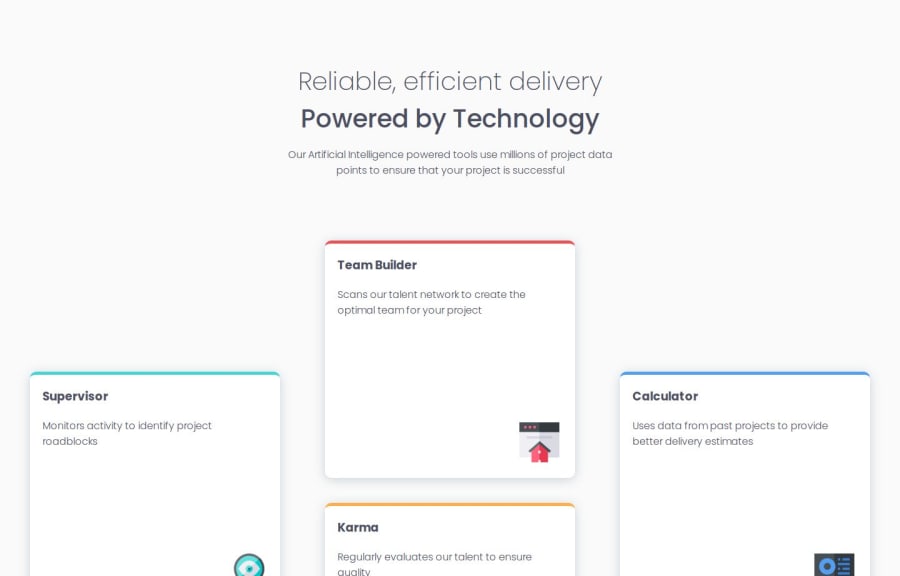
The card proportions are generally good. Add 2rem (32px) of padding to the cards for better spacing. Also, slightly reduce the card height.
The layout breaks on medium screens when resizing. This issue doesn't occur on smaller screens. A media query should resolve this.
The <h1> font size in the header appears too large, causing text to wrap unexpectedly on smaller screens. Reduce the <h1> font size within a media query for smaller screen sizes.
The <br> tag within the header's <p> tag is disrupting the layout on smaller screens. Remove the <br> tag. Instead, control the header paragraph's width using width on the container element to manage text wrapping. This will provide a more consistent and predictable layout.
Prioritize the use of rem units over px for sizing elements, padding, margins, and font sizes. rem units are relative to the root font size, allowing users to control the base font size in their browser settings. This makes your website more accessible to users with visual impairments or those who prefer larger text. Using px can create inflexible layouts that don't adapt well to different font size settings.
0

Please log in to post a comment
Log in with GitHub
Join our Discord community
Join thousands of Frontend Mentor community members taking the challenges, sharing resources, helping each other, and chatting about all things front-end!
Join our Discord