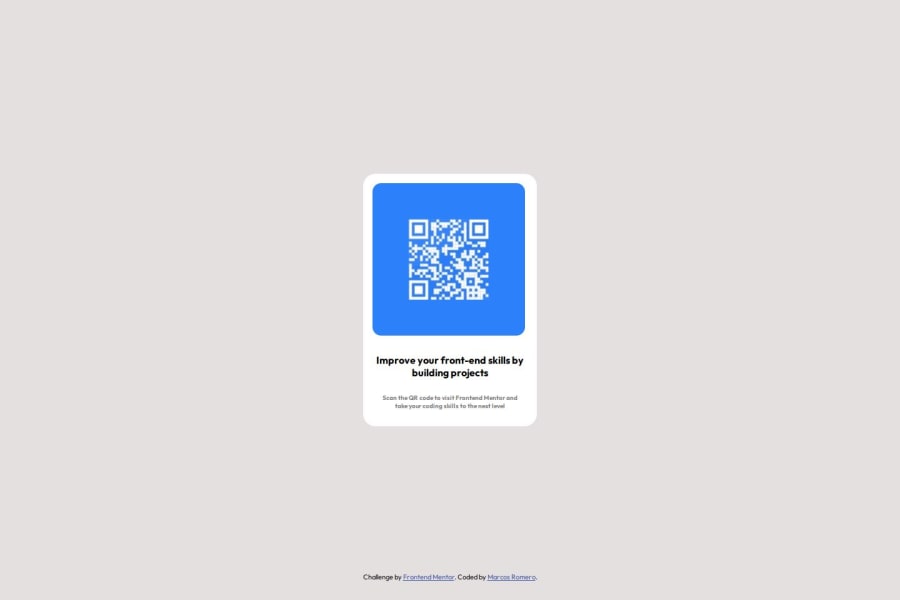
Design comparison
SolutionDesign
Solution retrospective
What are you most proud of, and what would you do differently next time?
I am proud to have been able to apply the little knowledge I still have in the area of WEB development.
What challenges did you encounter, and how did you overcome them?I have to continue practicing the skill of being able to make my designs responsive.
What specific areas of your project would you like help with?I am starting out in the world of WEB development and it really attracts me a lot. I appreciate any type of advice or criticism towards my projects and their presentation.
Community feedback
Please log in to post a comment
Log in with GitHubJoin our Discord community
Join thousands of Frontend Mentor community members taking the challenges, sharing resources, helping each other, and chatting about all things front-end!
Join our Discord
