@ChrisMulvanyGHSubmitted over 2 years ago
Will
@wkan17012021All comments
- @wkan17012021Posted over 2 years ago
Hi Chris,
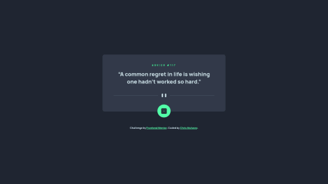
This looks great, good effort. I noticed the top line "Advice", the designs say #117 as well. Not sure if this was left out intentionally. The pause button icon and horizontal line look as per the mobile design which is great. When the screen is increased to desktop size, I notice the horizontal line doesn't extend laterally all the way to the length of the quoted text above.
Other than that, it's top notch. Happy coding =)
Marked as helpful0
