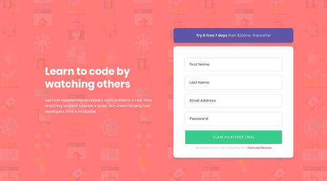
First attempt at a frontendmentor challenge. Please dont hesitate to tell me what you think I should improve.
noga
@noga-aviatorAll comments
- @cortarelvaSubmitted over 4 years ago@noga-aviatorPosted over 4 years ago
Blur a bit more the shadow, thoses are too dark and thin
0 - @prem1835Submitted over 4 years ago
I am a beginner so please correct my mistakes it will help me to learn
@noga-aviatorPosted over 4 years agoReally good but you forgot to make it responsive :D And the button doesn't appear
0 - @sarvagya2545Submitted over 4 years ago
Hello. This is my first attempt on this challenge. Any feedback is appreciated.
@noga-aviatorPosted over 4 years agoThe desktop part is really good except some colors that are not respected and some padding (tho it is hard to do without the mockup). But you forgot to make your website responsive !!!! So go make those @media queries :p
1 - @ShubhamVerma1811Submitted over 4 years ago
How can I crop out that device mockup at the same point at all widths?
Right now, the mockup crop at different points for different widths.
@noga-aviatorPosted over 4 years agoFirst you forgot that grey square in the background (hint: use position: absolute and z-index), secondly your padding is a bit messy. And about the device image, you need to change it depending on width (two way, javascript or a div with background-image property)
0 - @dselaseaSubmitted over 4 years ago
I need recommendations on how to implement mobile first. I couldnt resize the huddle logo to fit mobile screens.
@noga-aviatorPosted over 4 years agoYou don't need to resize it. I think i know why you think that. The design-mobile image show you the whole page, but that ain't supposed to fit on a screen. The user have to scroll through it. So everything seems small on the design.
0 - @Nemesis-ASSubmitted over 4 years ago
What improvements can be made to the shadows and can anyone help me with the borders for the cards?


