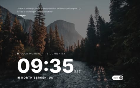
Comments and criticisms are welcome :)
Mo
@mo-rob-1All comments
- @JearlDevSubmitted almost 3 years ago@mo-rob-1Posted almost 3 years ago
Good job man, looks great! Only feedback is to remember to add alt text to the icon in your HTML to prevent accessibility issues.
Keep up the good work :)
0 - @peterhannellSubmitted almost 3 years ago
My solution to this challenge. I'm not 100% satisfied with it but I think it's close.
Any feedback and suggestions much appreciated.
@mo-rob-1Posted almost 3 years agoGood job dude, looks great! Also noticed in your code that you used the BEM technique and CSS custom properties.
Keep up the good work :)
Marked as helpful1 - @larissacauaneSubmitted almost 3 years ago@mo-rob-1Posted almost 3 years ago
Hey! You did a great job on this challenge. Well done.
After looking at your code, a tip I have is to have a look at the BEM methodology (Block Element Modifier) for naming your classes. This helps to keep your code organized and maintainable E.g. You could have a container div named 'card' and inside that div you can use naming conventions like 'card__img', 'card__desc' etc for the image and text.
Hope this helps & keep up the good work :)
Marked as helpful0


