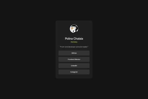
It would be interesting to know how to make the padding-top and padding-bottom smaller for mobile devices without using media query. With clamp()? Has anyone tried this?
jardellprod
@jardellprodAll comments
- @pchalaiaSubmitted 6 days agoWhat specific areas of your project would you like help with?@jardellprodPosted 6 days ago
I like how you modified the information provided to make it more personal. You also made the buttons hyperlinks I think that's actually pretty cool.
I think you succeeded in completing the project !
You also did a great job using max-width for the card size, this really made everything much more responsive. Also great use of the clamp function to size the text accordingly.
Marked as helpful0 - @Fr1nk5shSubmitted 12 days ago@jardellprodPosted 9 days ago
I really like the fact you used variables for the colors used in your CSS.
Also it's nice you went and added a footer with some additional information.
Your html and css are well structured. In the css it may not be as clear which properties are for which portion of the code, I would have to look at your html to compare, so using better naming conventions would be one thing to work on.
Also proportionally the card is smaller on the screen, but still great work.
Good job ! I really liked your approach.
Marked as helpful0 - @pipknightSubmitted 10 days ago@jardellprodPosted 10 days ago
You really went above and beyond by adding a shadow in your code. I think that's actually pretty cool.
I didn't use a section for my card, instead I used a div.
Great work with clear class names, I think I could have implemented this as well.
I would have also included a CSS Reset, it makes things a lot easier, but still great work !
0


