devb0x• 240
@devb0x
Submitted
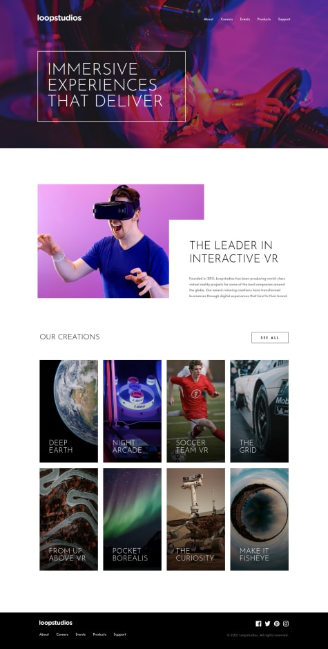
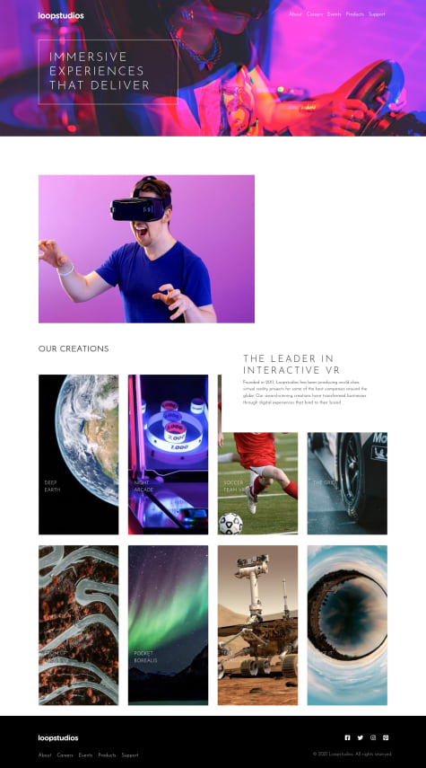
Any feedback always appreciated. Specially with the grid part :p thanks !
@AlperMehmetOzdemir
@devb0x
Submitted
Any feedback always appreciated. Specially with the grid part :p thanks !
@AlperMehmetOzdemir
Posted
Very nice implementation. I especially liked the smooth hover animation. The only improvement i could suggest is to disable scroll when the navigation overlay is active on mobile.
@AlperMehmetOzdemir
Submitted
@AlperMehmetOzdemir
Posted
For some reason the design comparison window shows my cards misaligned. You can check the preview site for a more accurate representation.
@valencydickson
Submitted
Any suggestions on how I can improve are welcome!
@AlperMehmetOzdemir
Posted
Increasing the font size for the hero section title and the creation section produt titles would be nice. You can add a trasparent black overlay on the images (both hero and creation section) with a value like rgba(0,0,0,0.25) to increase the contrast between the typography and images. Of course you can also fix the text box's positioning. I recommend checking out "position: relative" & "position:absolute" and how to use them. It think it will help you out alot in your future layouts and designs.
Nice job though. Keep up the good work.