Understanding the four principles of accessibility
Creating accessible interfaces is one of a web developer's primary responsibilities. In this article, Queendoline outlines four accessibility principles to help you build more inclusive sites.
Table of contents
According to Merriam-Webster’s dictionary, accessibility emphasizes the capability of something to be reached or used by everyone. This definition applies to the websites we build. Accessibility means that everyone should be able to access your website and use it to its full potential. When you make a website, ask yourself this question: Can everyone navigate around this website comfortably, or did I build this website for a specific group of people?
In this article, we will look at how we can create more inclusive and accessible websites using the four core principles of accessibility as stated by WCAG, which are:
-
Perceivable
-
Operable
-
Understandable
-
Robust
The World Health Organization (WHO) has stated that an estimated 1.3 billion people are living with some form of disability in the world, and these include people living with temporary disabilities, like a broken arm. Disabilities can affect how people navigate the web, and our goal is to make our websites accessible to them.
Understanding the POUR principles
These principles ensure that web content is available to all, including people living with disabilities. Following these guidelines improves user experience, which is beneficial to everyone.
Perceivable
Perception involves using your senses to comprehend information. Therefore, perceivability is the foundation of our website's accessibility. Perceivability includes being able to see and hear information.
When you create a website, you send a message for someone to receive and give adequate feedback. People need to be able to receive your message before operating or even understanding it.
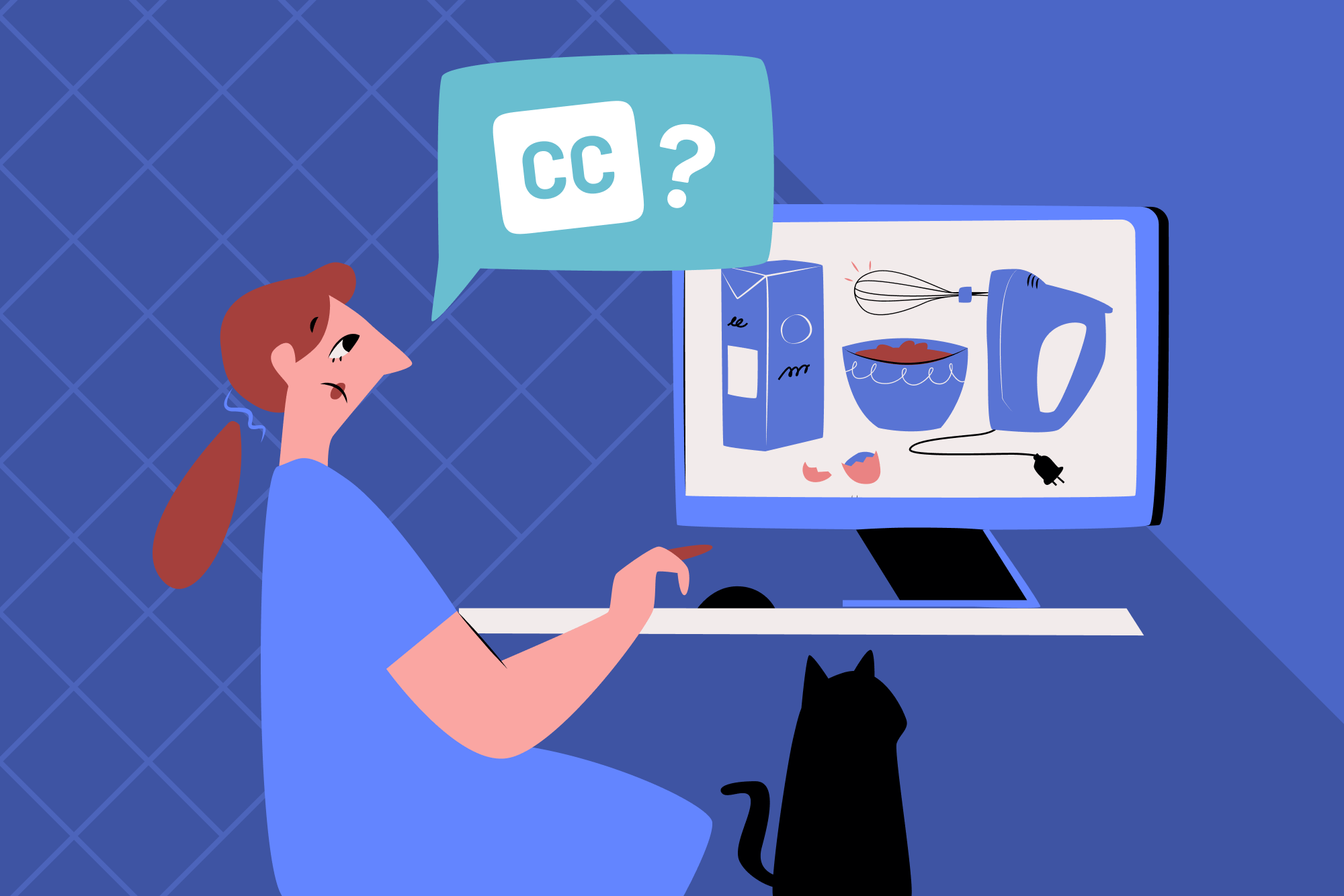
Let us look at an example situation for a deaf person who visits a website with video cooking tutorials. How do you think this visitor will perceive the content? If you have audio or video content (non-text content), you need to provide text alternatives so they can perceive them, too, just like people who listen to the audio. Without providing text alternatives like captions and transcripts, you are creating a barrier and making your website content inaccessible to this visitor and others in a similar situation.

MDN provides excellent guidelines to ensure your content is perceivable, which includes additional links to other useful resources.
Operable
Okay, let us say you have succeeded in making your website perceivable. But can people interact with the elements and perform tasks on your website efficiently, regardless of the technologies they are using? Do not assume that everyone who surfs the web uses a mouse.
Using the keyboard to navigate a website is the most common way to test operability. This involves using keys like TAB, ENTER, the arrows, and the space bar to interact with and navigate form fields, links, dropdown menus, controls for a media player, and so much more. It's an alternative way to move around a page without a mouse, and different assistive technologies employ this method for people living with disabilities.
Regardless of the input device people use on your website, they should be able to efficiently perform all functions and navigate their way around the website.
Let us look at another possible scenario. A blind person visits an e-commerce site to buy something. They use a screen reader (an assistive technology that converts text and graphical elements on the screen to speech) to perceive the information on the website. To make the site accessible, you must ensure it is operable by people using different navigation methods. Otherwise, they may be unable to complete their purchase or navigate your site effectively.

Check out MDN’s guidelines to help ensure your website is operable for more details and resources.
Understandable
Let’s say your website is perceivable and operable by various assistive technologies, but can everyone understand its content? Guidelines on making your website more understandable include ensuring consistent navigation, clear error identification, labels and instructions, and more. You want to make your content as easy to understand as possible.
Let us take an example of a visitor with dyslexia (a disability that makes it difficult to read and spell words). To make your website content more understandable, you can use readable fonts, format your content correctly, and use clear and straightforward terminology, among other things. Here’s an excellent resource about how to improve your written content for dyslexic people by the British Dyslexia Association.

Making your content understandable also relates to areas such as language. So, ensuring your website has the lang attribute set on the <html> element is vital. MDN provides useful guidelines to ensure your website is understandable.
Robust
A robust website ensures that your website is accessible across different user environments. This means that the website meets the user where they are, can adjust to their device and browser choice, and can adapt to various input methods and assistive technologies.
Browsers interpret code and render websites differently, affecting how the content appears on the webpage. You want to ensure your website is responsive and compatible with various browser versions. Do not limit the compatibility of your website to specific devices, browsers, or tools.
Consider a scenario in which someone tries to access your site on a mobile browser when it is not responsive. This might make your site unusable or, at least, very hard to use. As you learn to test your websites in different environments (e.g., browsers), you'll start creating more robust interfaces.

Read MDN’s guidelines to help ensure your website is robust.
Case study example
To put everything into perspective, the example below shows two basic forms. The first neglects the POUR accessibility principles, while the second form adheres to them.
Non-accessible form example
<form action="#">
 <label>Name:</label>
 <input type="text" name="name" required>

 <label>Email:</label>
 <input type="text" name="email" required>

 <div onclick="submitForm()">Submit</div>
</form>
Here are some issues in this HTML structure:
-
Inputs without associated
<label>elements. This means screen readers won’t announce the labels when the field is focused, and clicking the label won’t bring the relevant input into focus. -
The email input doesn’t use
type=”email”. This means the browser won’t validate the correct email format. It also means people on mobile devices won’t see the email-specific keyboard when inputting their email address. -
There are no placeholders to help show expected input formatting.
-
A
divelement with an event listener is being used for the form submission. This means anyone not using a mouse or trackpad can’t submit the form.
Accessible form example
<form action="#">
 <label for="name">Name:</label>
 <input type="text" name="name" id="name" autocomplete="name" placeholder="Jane Doe" required>

 <label for="email">Email:</label>
 <input type="email" name="email" id="email" autocomplete="email" placeholder="[email protected]" required>

 <button>Submit</button>
</form>
Here are some of the improvements we’ve made:
-
<label>elements are now properly linked to inputs usingforattributes on the labels andidattributes on the inputs. -
The email form input now has
type=”email”set, which will validate for correct email formats and display the email keyboard for mobile users. -
The inputs now have placeholder text to prompt the user as to the expected format for the input.
-
Adding
autocompleteattributes withnameandemailvalues prompts the browser to offer auto-complete suggestions. This can help remove barriers for people with cognitive or mobility disabilities. -
We’re now using a
buttonelement, which automatically submits the form when clicked. It is also a focusable interactive element accessible to people using a keyboard or other navigation method.
Conclusion
This article has introduced you to the core principles of web accessibility and how crucial it is to implement these guidelines in your projects. We have discovered the importance of placing your users at the center of your products. This approach not only broadens your audience but also improves the user experience on your site for all visitors.
Don’t just read this article; implement these skills in your programming career! Here are a few Frontend Mentor challenges that are perfect to help you practice what you’ve learned:
-
FAQ accordion: Ensure all content is accessible through keyboard navigation and is announced whenever a new answer is displayed.
-
Interactive rating component: Ensure the ratings and form submission are available through keyboard navigation. Make it so screen readers announce the content change once the form is submitted.
-
Newsletter sign-up form with success message: Ensure the form is accessible and screen readers announce the error and success states.
Happy coding!
Take your skills to the next level
- AI-powered solution reviews
- 50+ portfolio-ready premium projects
- Professional Figma design files