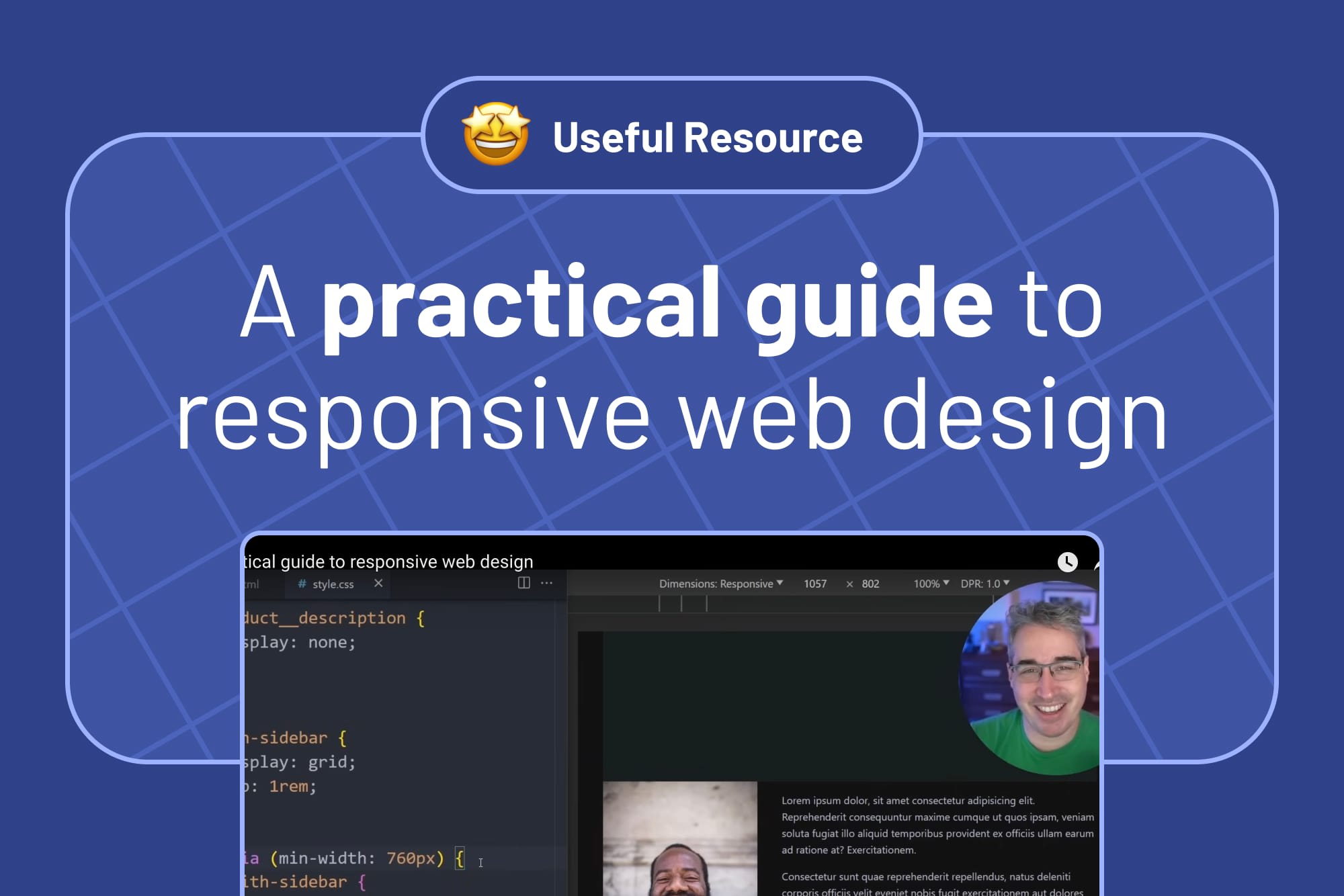
A practical guide to responsive web design
An excellent, short(ish) video by Kevin Powell that's packed with helpful tips, tricks, and mental models for creating responsive layouts.
Table of contents
Following on from my article about adding hand-curated front-end resources from around the web to our own articles, I thought I'd add our first!
Using modern CSS techniques to work with the browser

I loved watching Kevin Powell's recent video offering a practical guide to responsive web design. Kevin outlines some excellent ways to leverage modern CSS techniques to put as much heavy lifting on the browser as possible when building responsive layouts.
Not working with the browser is something we see often in people's Frontend Mentor solution submissions. Community members sometimes focus on getting their solution "pixel perfect" and add absolute units, like px units, to height and width properties to match the design. That might have been OK back in the late 90s when all we had were desktop computers. But it won't cut it these days!
People can access the web from all kinds of devices of all sizes. So, as web developers, we need to build for all possible screen sizes, not just a few. This means working with the browser to allow content to wrap and scale as needed. Luckily, we have a load of new CSS features that can help us do precisely that!
If you're new to building responsive layouts, Kevin also has an excellent (and free!) course called Conquering Responsive Layouts that I recommend checking out.
Do you have any resources to share?
If you discover any relevant resources for front-end developers you'd like to mention, please feel free to share them in our Discord resources channel 🙂
Take your skills to the next level
- AI-powered solution reviews
- 50+ portfolio-ready premium projects
- Professional Figma design files