What are you most proud of, and what would you do differently next time?
I am proud of going a step further with the responsive design and adding a mid-size screen breakpoint with a third layout of the 4 cards.
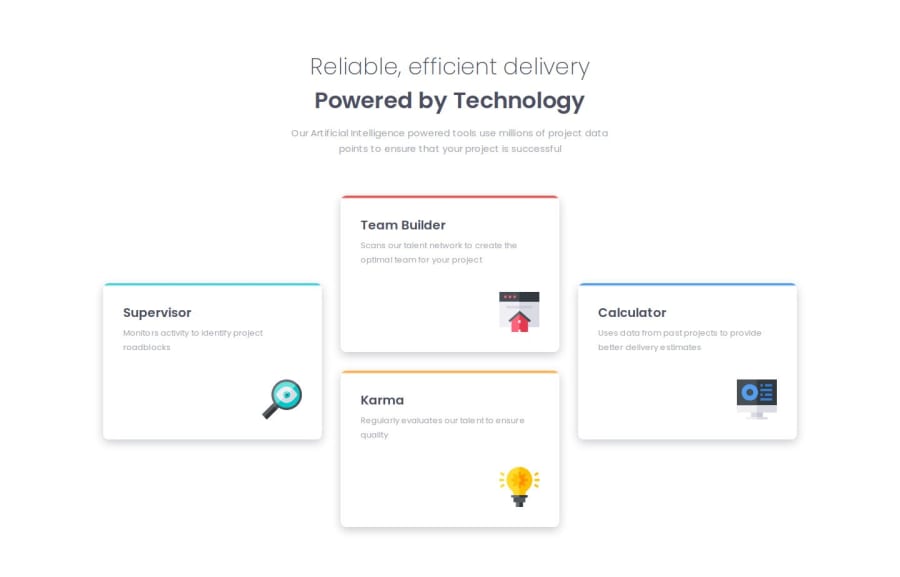
I was also proud to accurately dial in the little colored accent lines at the top of each card and get the box-shadow effect very close to the design.
Next time I will try to pace myself better. I got a bit manic with my styles and started getting sloppy with writing my code. This made more work for me later in tidying things up.
What challenges did you encounter, and how did you overcome them?
I had a much harder time getting the colored accent stripe right on the top of each card. I first tried just a top border but it didn't look right. Then I tried creating a separate div inside the card but that didn't achieve the right look either. Finally, I created a linear gradient in the background and I think that did the trick.
I also spent more time that I would have like tweaking details like margins and padding in the desktop layout.
What specific areas of your project would you like help with?
In terms of layout and sizing, where is it OK to use absolute units like px and when should I be using em or rem?