


P
Nate Valline• 200
@nvalline
Posted
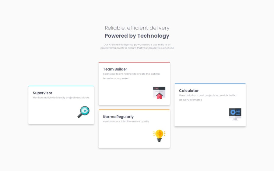
Great job on the challenge! One suggestion that could help the user experience is adding some max-widths on some of the element containers so that they don't overstretch as the device screen changes.
For example the H1 title and the p desc stretch to an awkward width before the media query is reached at 768px. Adding a max-width and text-align center will help with the aesthetics.
Hope that is helpful.
Marked as helpful
0
