@FengDenny
Posted
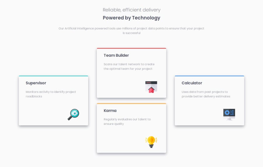
Hey, nicely done, but to give you some tips on responsive measurements or when should we should Flexbox over Grid or vice-versa:
Use Flexbox When:
-
You're working with a one-dimensional layout, either in a row or a column.
-
You want to align items within a container along a single axis (either horizontally or vertically).
-
You need to reorder items within the container.
-
You're creating a navigation bar, a sidebar, or a flexible card layout (like this project).
-
You want to evenly distribute space between items or align items with different sizes.
-
You're working with dynamic content where the number of items may change.
Use CSS Grid When:
-
You're working with a two-dimensional layout, needing to align items both horizontally and vertically.
-
You need to create complex grid-based layouts with multiple rows and columns.
-
You want to create a responsive layout that adjusts its structure based on screen size.
-
You're designing a grid-based gallery, a magazine layout, or a webpage with multiple sections.
-
You need to align items in both dimensions, and their sizes are consistent.
-
You want to control the alignment of the whole grid (e.g., centering it within the viewport).
In Summary:
Flexbox is best suited for one-dimensional layouts, such as navigation bars, flexible containers, and aligning items along a single axis.
CSS Grid is ideal for two-dimensional layouts, like complex grid-based designs, multi-column layouts, and aligning items both horizontally and vertically.
In many cases, you'll find that using a combination of Flexbox and CSS Grid provides the most flexible and efficient way to create modern layouts.
You can use Flexbox for smaller, one-dimensional layouts within larger, two-dimensional Grid layouts.
Happy frontending =)

